DFO Resource Repository
Year:
2024
Duration:
8 months
Role:
UX Designer
Project Overview
Objective
The Department of Fisheries and Oceans Canada (DFO) initially approached our team about creating a new design system. Through user research, we uncovered a more immediate need: a centralized repository for design resources. The objective became designing a resource hub that would reduce inconsistencies, improve collaboration, and prepare the department for a future design system.
Problem
The DFO faces a challenge with its current design systems. These systems are outdated and applied inconsistently across the various web pages and products the department manages. Furthermore, poor communication between departments is causing inconsistencies in the development and implementation of design system components.
Solution
A resource repository, serving as the definitive source for design resources, tools, and guidelines within the Department of Fisheries and Oceans Canada.
Team
This project was completed with a team of designers at Wilfrid Laurier University. Our team included Chantal Vaillancourt, Emily Xiao, Hana Kidwai, Katryn Relleve, Nafisa Tasnuva, Simrit Dhillon, Yuki Xu, and myself. The project included four deliverables, and the work was divided and agreed upon through a contract at the start of each deliverable.
Problem Phase
Target Users
One of the first steps of the project was defining the target users. At this stage, we had not conducted user research yet, so our target users were based on informal conversations with members of the DFO and some assumptions. The target users we defined were as follows.
Designers: Designers use Figma to create assets for developers at the DFO. Design systems allow designers to keep design components consistent across various channels.
Developers: Developers build applications for the DFO using a variety of frameworks. Design systems provide developers with reusable components that increase the efficiency of their work.
QA Testers: QA testers compare what has been built to the intended functionality and style documented in the design system. They test thoroughly to ensure everything is running smoothly.
User Interviews
Participants were recruited from the DFO for virtual interviews conducted via Microsoft Teams, each lasting 45 minutes. The sessions involved asking open-ended questions to gather qualitative data and were recorded, with notes logged on a spreadsheet.
Research Goals
Understand how the DFO team currently uses design systems in their workflows
Identify major pain points within the existing processes
Identify goals and expectations of various stakeholders, including those in design, development, and marketing, regarding a shared design system
Analysis
We analyzed 385 minutes of interview data by organizing insights in FigJam and using affinity mapping to identify key themes and patterns from the 12 participants.
Key Insights
Lack of Consistency: The use of multiple design systems/guidelines used at the DFO produced varied user experiences and inconsistencies. There was a lack of standards, from individual components to mandating designs and policies. As a result of inconsistency and lack of direction, DFO employees get confused and have difficulty finding what they need.
Lack of Collaboration: There was no centralized design resource for users to refer to; everyone had a different way of ensuring compliance. Additionally, once wireframes and designs were established, there was minimal design auditing or testing following handoffs. Overall, teams generally operate independently and are mostly self-sufficient; however, there is low collaboration and open communication among various departments.
Lack of User Testing: Testing primarily involved clients rather than target users. Government policies limited the DFO’s ability to do user testing with end users, which caused frustration.
Some potential causes for the points above are as follows:
Low Design Maturity: A major challenge was the low design maturity of the DFO. There was a lack of awareness across teams about design systems and processes at the DFO.
Organizational Constraints: At the time of the user interviews, the DFO had a very small design team. There was also limited funding available for design projects.
Development Tool Constraints: The existing design systems were missing some essential components that developers needed. The design systems also had compatibility issues with modern frameworks, such as Angular and React.
Competitive Analysis
Our team conducted a competitive analysis. This involved examining the established design systems of other government organizations and technology companies. Although these organizations and companies are not direct competitors of the DFO, their systems were valuable in helping us determine the typical content included in a comprehensive design system.
UK Gov | US Gov | France Gov | Shopify | Atlassian | ||
Usage documentation | ✓ | ✓ | ✓ | ✓ | ✓ | ✓ |
Developer guides | ✓ | ✓ | ✓ | ✓ | ✓ | ✓ |
Component anatomy | ✓ | X | X | X | ✓ | ✓ |
Experience values | X | ✓ | X | ✓ | ✓ | X |
Responsive design | X | X | ✓ | X | X | ✓ |
Supporting research | ✓ | X | X | X | X | ✓ |
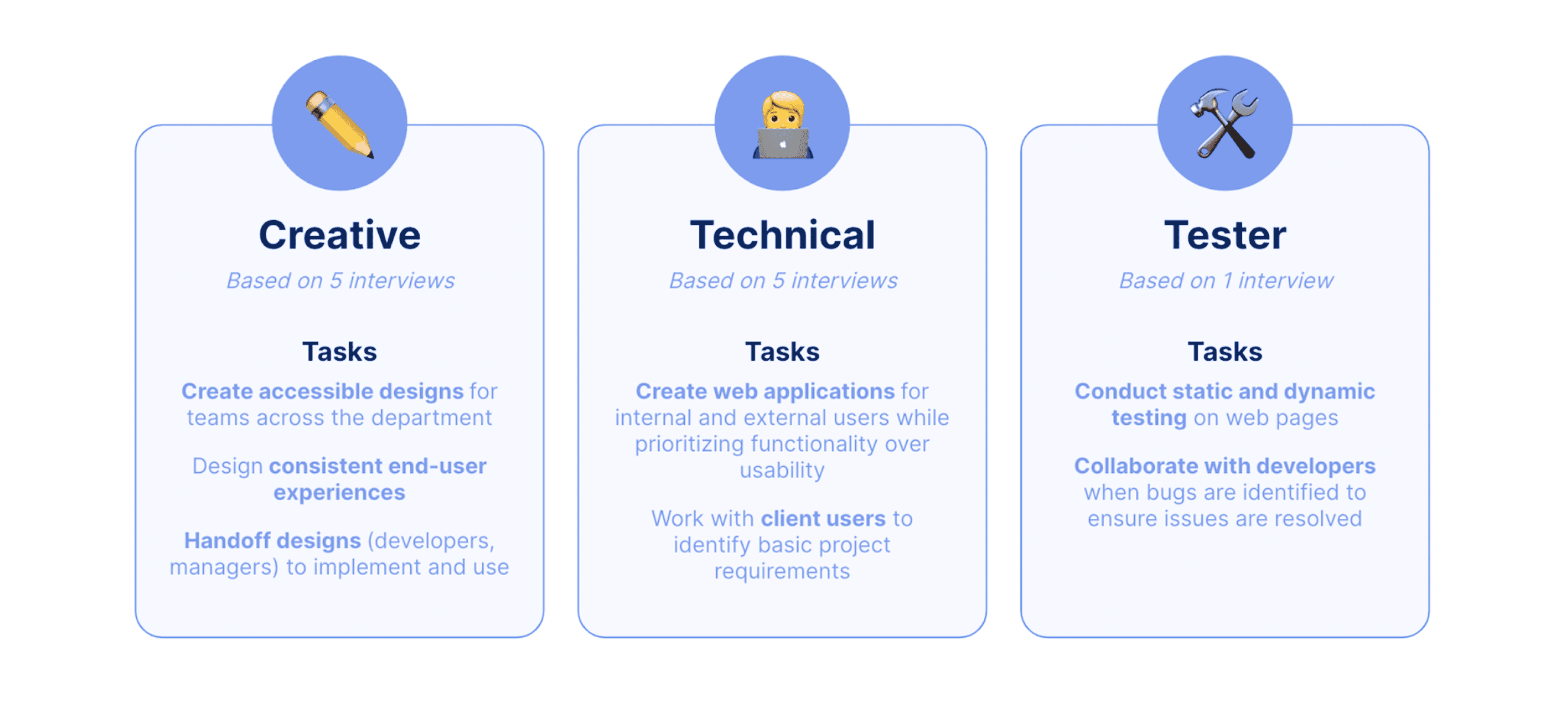
Personas
We used our research to create role-based personas; however, after receiving feedback, we refined our personas to be task-based. The following image is a summary of our personas.
Ideation Phase
From our ideation session, we pivoted our initial approach of creating a design system to designing a resource repository. This change was mainly because we found through our research that the DFO's design "team" only included one full-time UX designer at the time, and maintaining a brand new design system would be too challenging and time consuming on top of their regular responsibilities. The DFO also already had a lot of good design resources and design systems, but they were not centralized in one place.
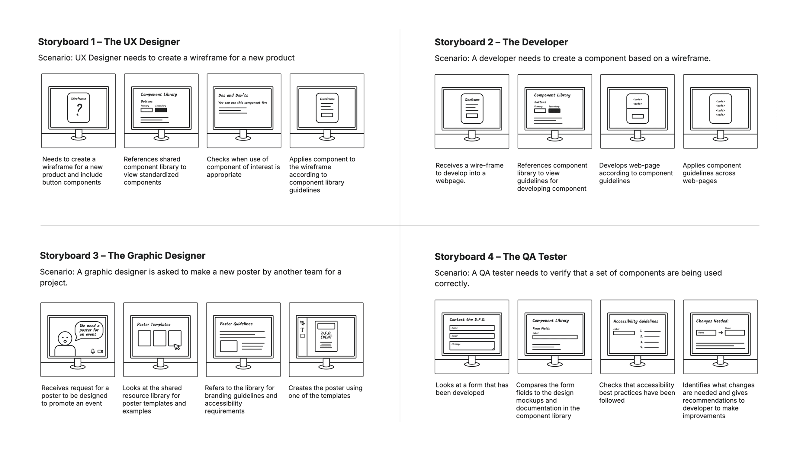
Storyboarding
Storyboards were made to reflect each of our four original personas: The UX Designer, The Developer, The Graphic Designer, and The QA Tester.
Card Sort
We used a Google Form to gather the tools and resources DFO teams use regularly, then ran an open card sort with five participants in Optimal Workshop. The results confirmed our assumptions and revealed opportunities for new content. Users naturally grouped items into “design” and “development” tools, which we included in the prototype. The card sort also highlighted the need for “communication/collaboration” and “project management” categories, which we added to the low-fidelity prototype.
Prototyping & Testing Phase
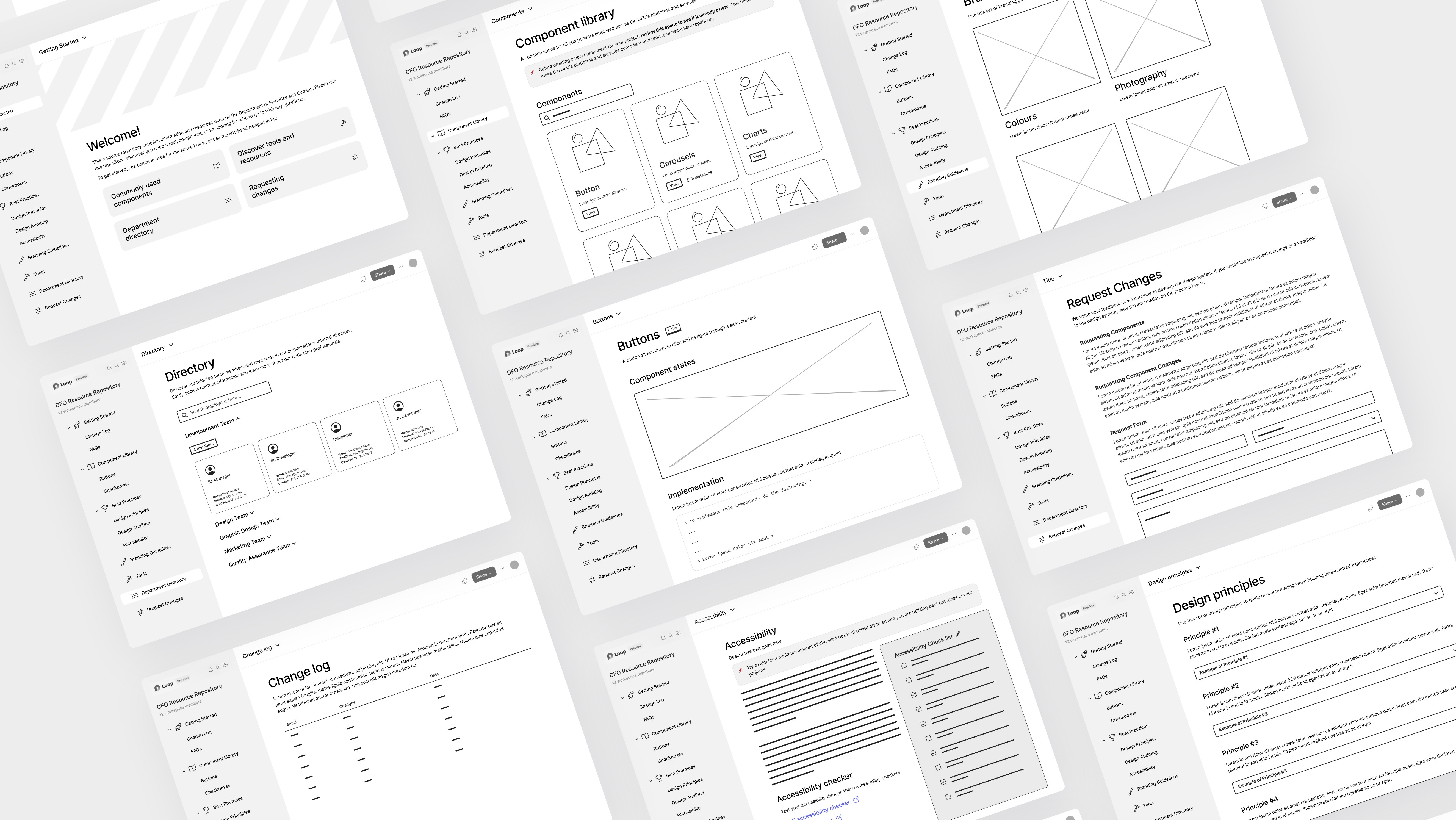
Low-Fidelity Prototype
We developed the low-fidelity prototype, a 17-screen clickable wireframe, based on Microsoft Loop as the DFO expressed enthusiasm for the platform. Screens were designed individually and then refined in a meeting to ensure users could complete the tasks specified in the moderated testing guide. The screens can be accessed in this Figma file.
Moderated Usability Tests
Our team conducted virtual usability testing sessions, each lasting 45 minutes, to evaluate different aspects of the prototype. Participants were given a series of tasks that required them to navigate key pages within the resource repository. Throughout the tasks, participants were encouraged to think out loud.
Qualitative Insights
The user study revealed mixed results. Tasks involving finding official colours and requesting new components were largely successful, suggesting effective design and clear instructions in these areas. However, the task related to the change log had a notably low success rate, indicating a critical need for a more intuitive design and clearer guidance for this specific feature.
Quantitative Insights
Most tasks were successful, particularly those involving the Request Changes, Directory, Branding Guidelines, and Component Library pages, which participants navigated quickly. Challenges in reaching the Best Practices and Accessibility pages resulted in a 14% partial success rate. The general Best Practices page task had the lowest success rate, contributing to the 14% overall task failure rate, and was later revised in our next iteration.
Mid-Fidelity Prototype
Following moderated user testing, we implemented several changes to our low-fidelity prototype. To see our full mid-fidelity prototype, follow this link.
Information Architecture
We initially altered the page navigation's information architecture. We clarified labels (e.g., Best Practices became Foundations) and reordered pages to align with user expectations (e.g., moving the FAQ page and Change Log from Getting Started to Help).
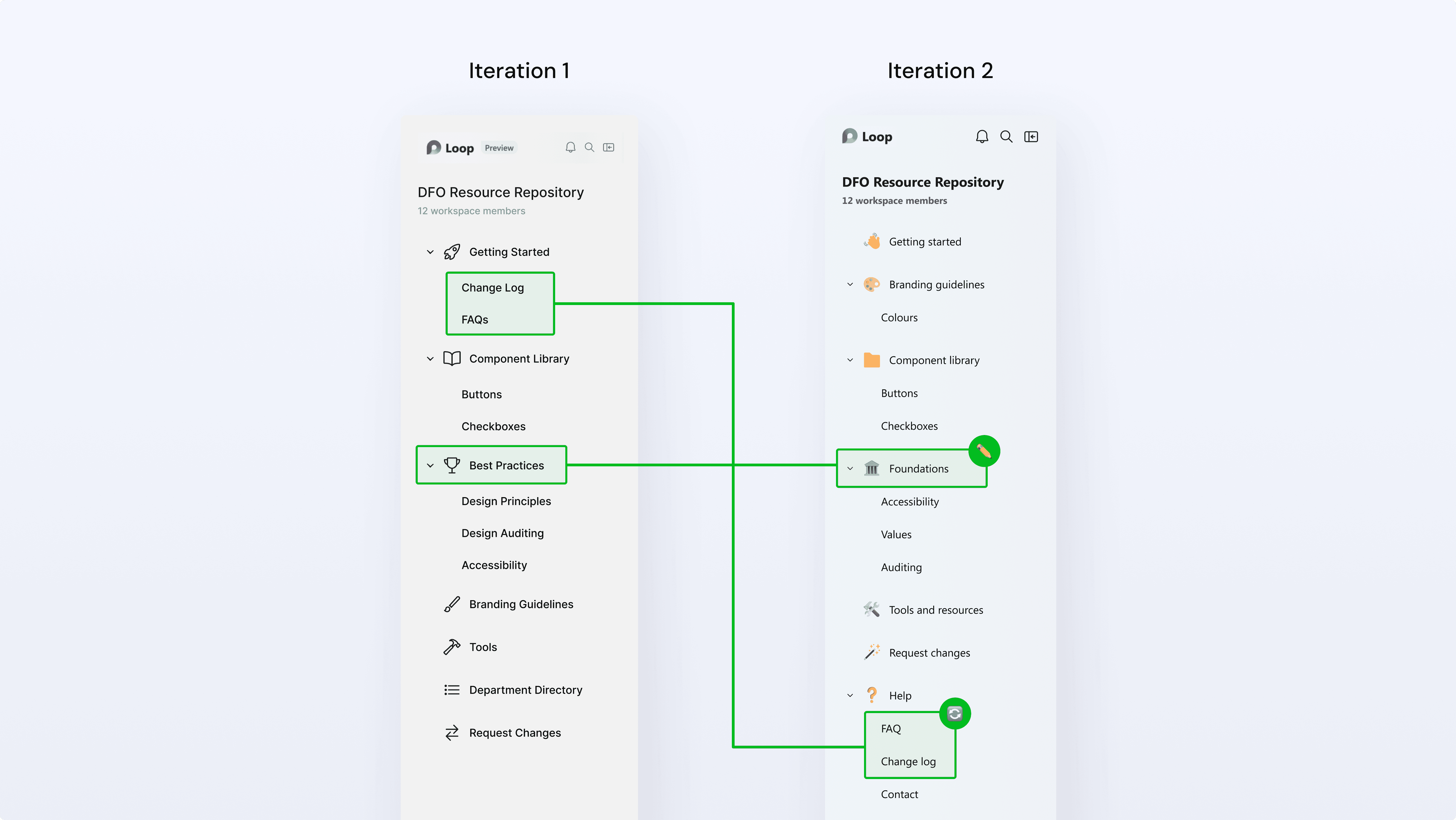
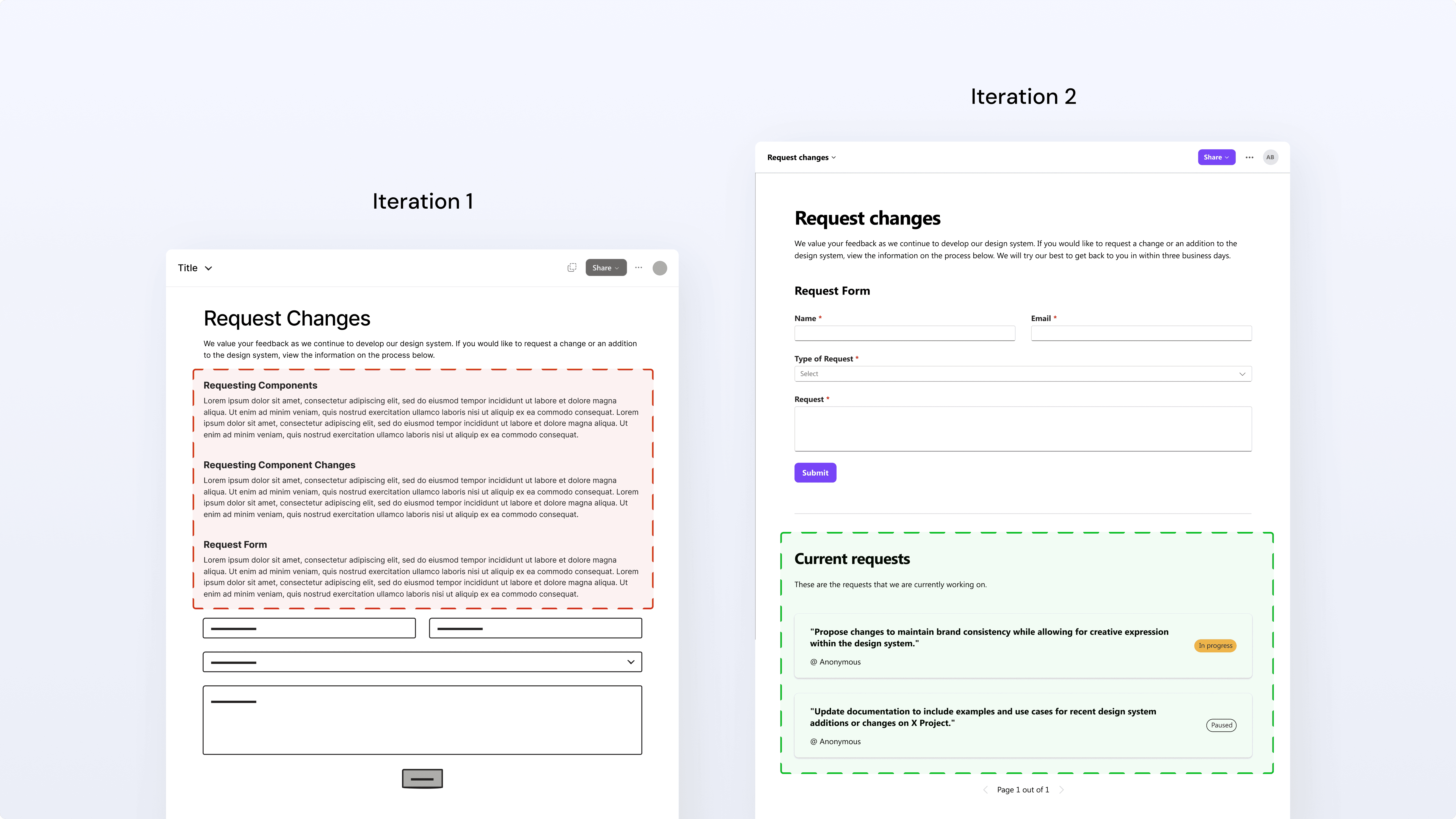
Change log
Another update we made was to the change log. The initial text-heavy version was reduced in the second iteration. We also added an upvoting section for current requests, which helps minimize repetitive submissions.
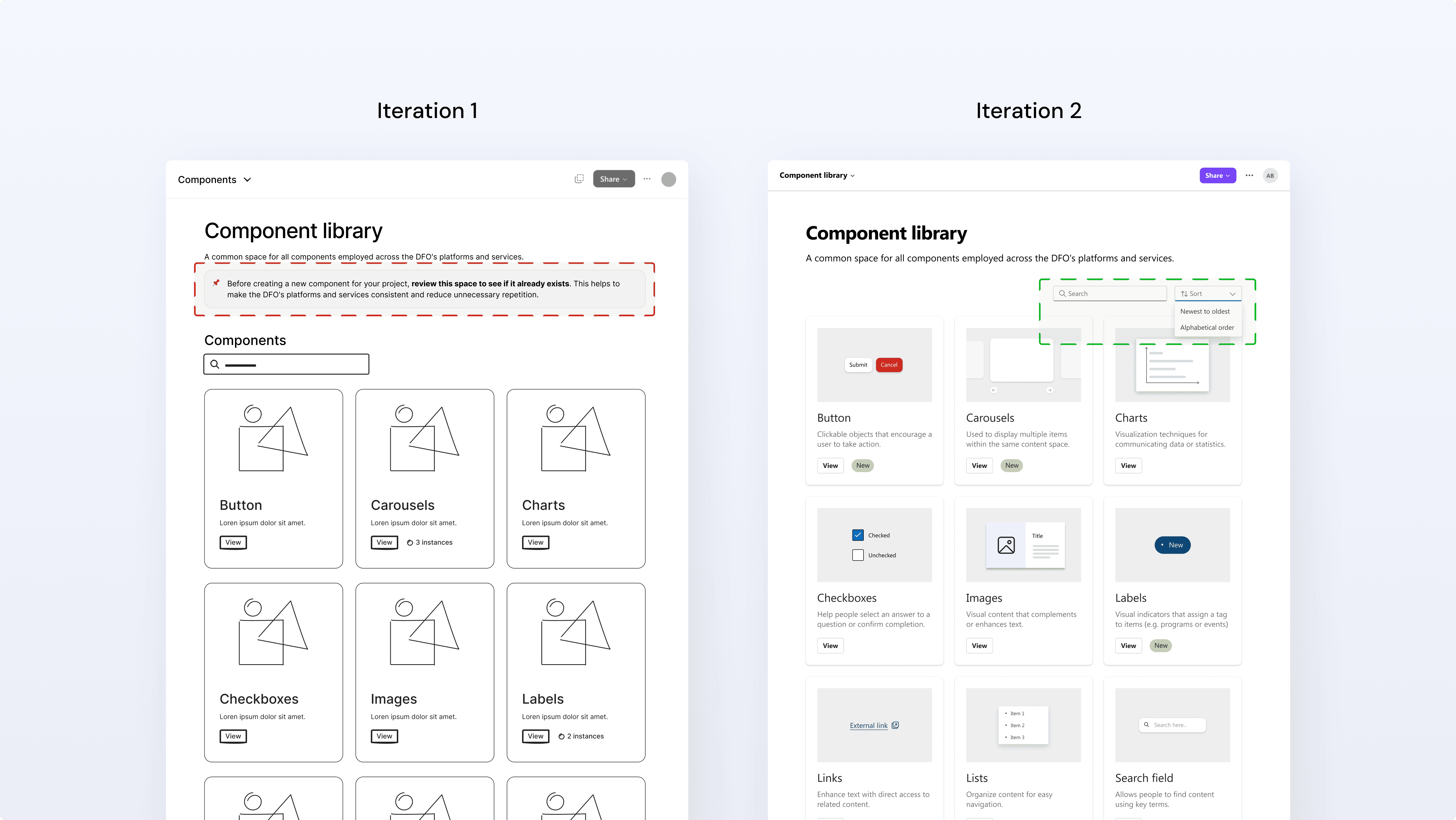
Component library
Updates to the component library page include adding a sort option: alphabetical, and "newest to oldest" for easy access to recent additions. We also removed an alert that we had in our first iteration. The alert reminded users to check for duplicate components before making a new request. However, we learned that there would be one dedicated team making changes to the components, not users from multiple teams, so the alert was unnecessary.
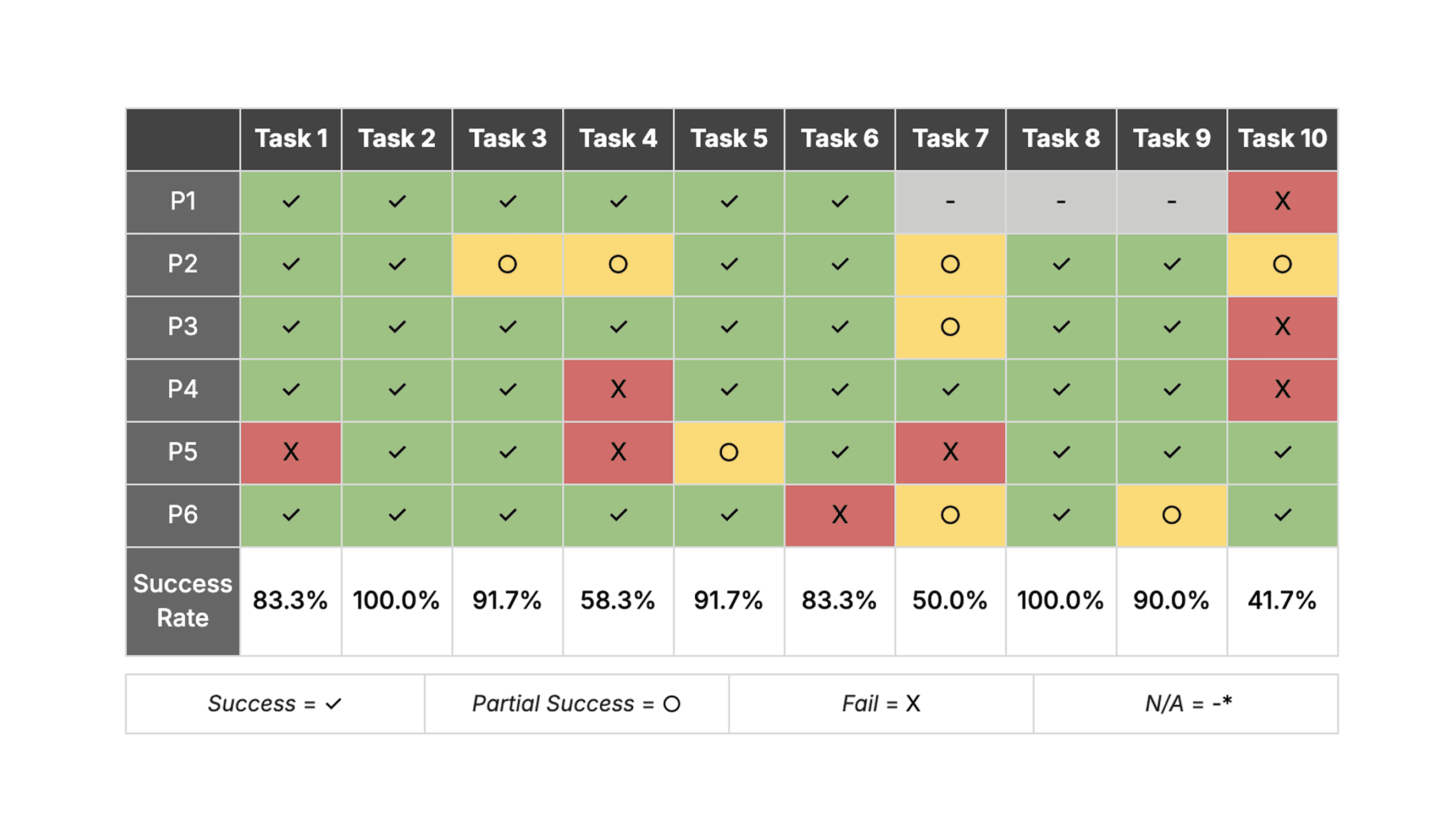
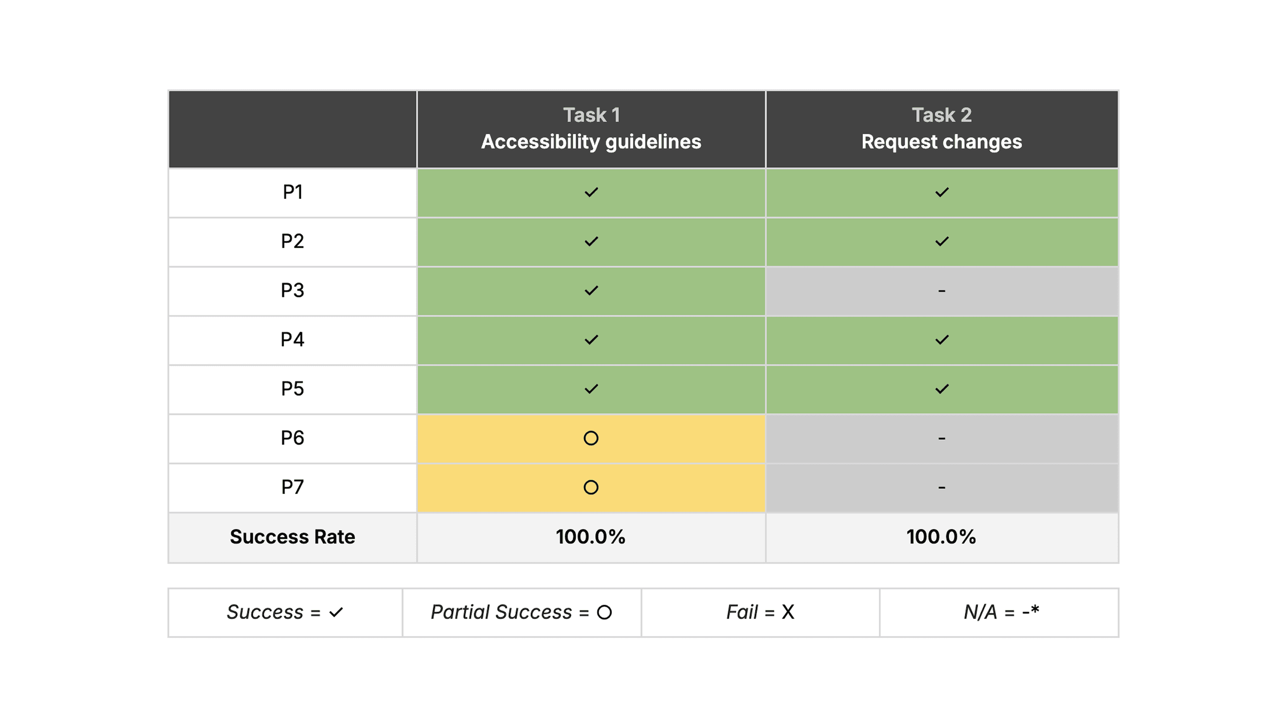
Unmoderated Usability Tests
We used a tool called Maze for unmoderated usability testing. The main goal was to see if mid-fidelity prototype changes solved initial problems, gather general impressions, and allow full exploration.
There were 7 participants from the DFO in total: 4 participants fully completed the test, and 3 participants partially completed the test.
To analyze the results of our unmoderated test, we reviewed the following data from Maze:
Pathways taken by participants
Success rates per task
Open-ended question responses
The results of the tasks that require users to interact with the prototype are below:
Open-Test Response Insights
Question 1: If you're looking for existing documentation for a checkbox component, would this page be helpful to you in your role? Please explain why or why not.
Participants generally felt the page offered a clear and concise summary of the component, providing an appropriate level of detail and being easily scannable for essential information. A suggestion raised was to include a direct Figma link alongside the components.Question 2: If you're looking for new documentation for a button component, would this page be helpful to you in your role?
Participants generally agreed that the page offered an effective summary of the components and utilized a clear, easily digestible layout.Question 3: Considering everything you've seen in this session, were there any issues or obstacles you encountered?
Participants did not report any issues. However, one participant expressed skepticism regarding Loop's functionality and whether the proposed changes could be implemented on the platform.
User Group Insights
Our research showed that designers wanted accessible, consistent assets and smoother handoffs, while graphic designers shared similar needs around maintaining consistent resources. Developers, meanwhile, needed clear, reliable guidelines, components that actually worked with their frameworks, and more structure around accessibility requirements. This suggested opportunities for standardized guidelines to boost design consistency, improve inter-team communication, and establish accessibility standards.
Final Prototype
We created our final prototype with Figma based on the wireframes and the medium-fidelity prototype. Since our unmoderated testing did not reveal any critical pain points, our focus for the final prototype was on making minor enhancements to the user interface and overall experience. To see our Figma prototype, follow this link.
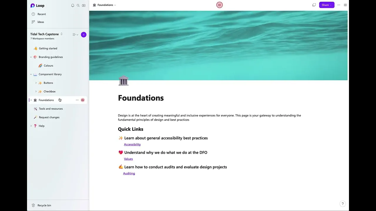
Getting Started
The landing page gives an overview of the repository and offers quick links to commonly used pages. These links can evolve as the department’s needs change.
Branding guidelines
This section provides easy access to DFO’s core branding guidelines, helping teams keep their products visually consistent across the department.
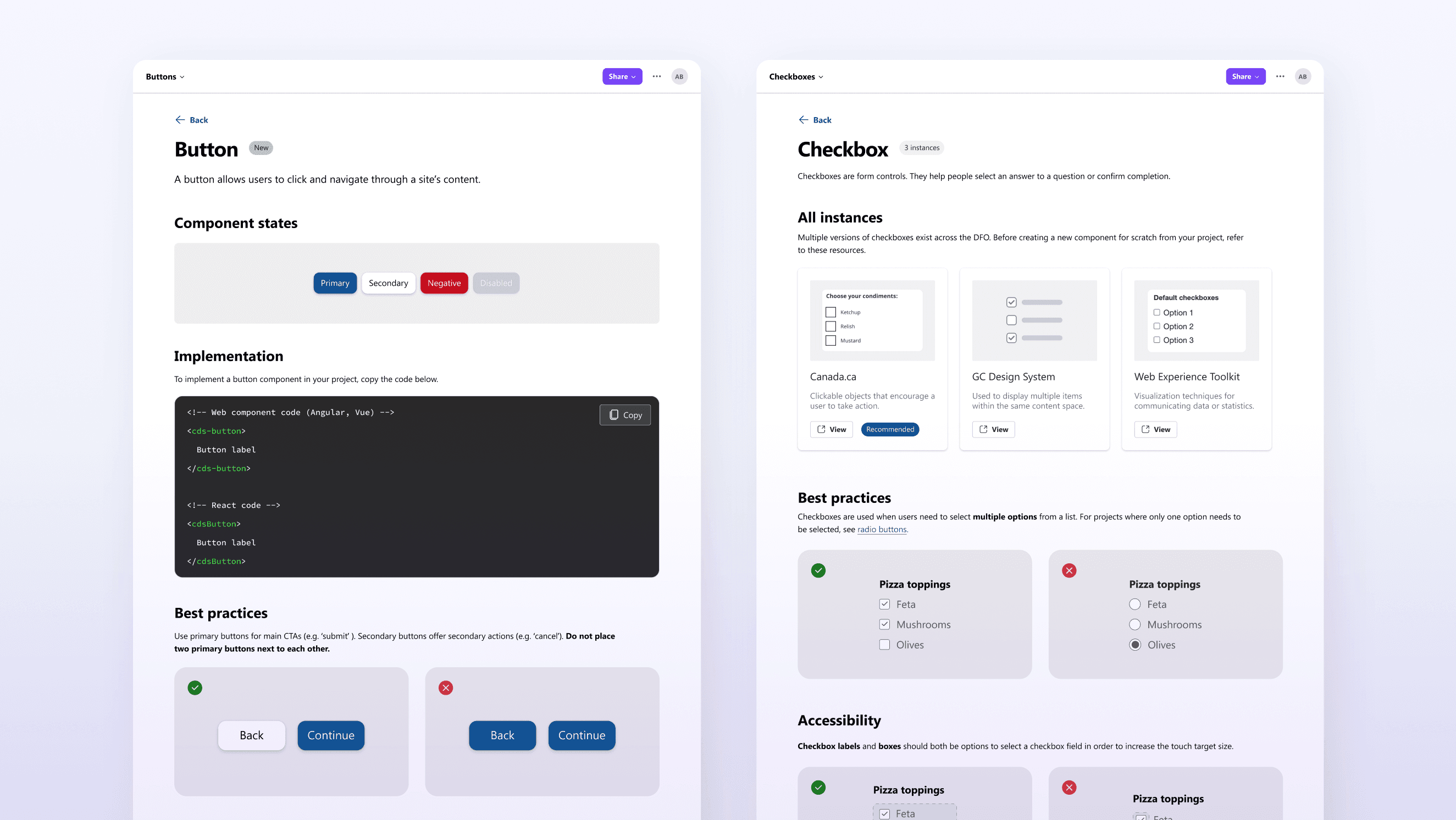
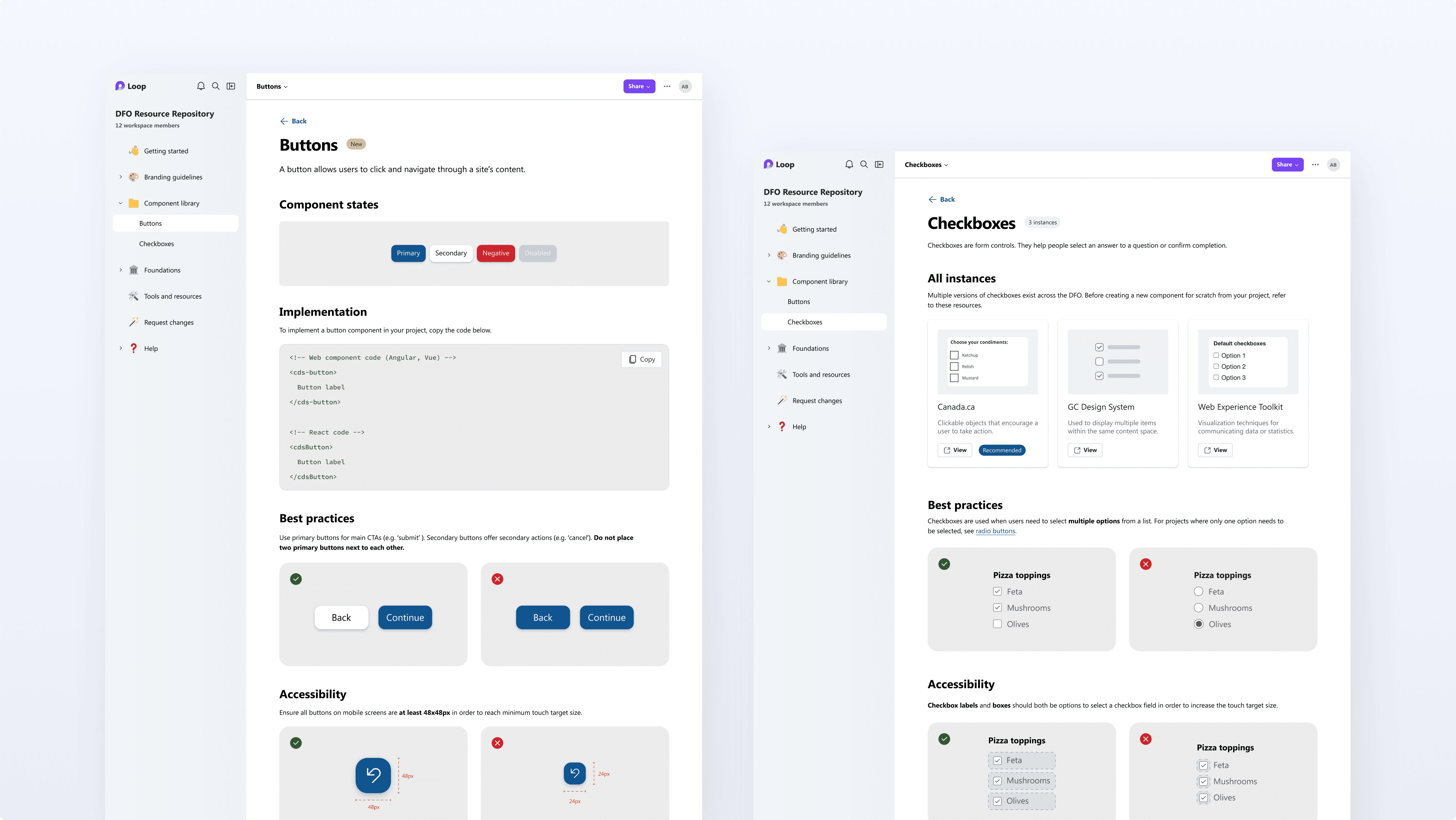
Components
The Component Library includes two page formats to support different needs. The first (left) is for newly created components which do not already exist within the DFO. The second (right) provides external links when multiple versions of a component exist.
Foundations
The Foundations section houses key foundational content for the repository. It links to pages such as Accessibility, Values, and Auditing.
Tools and resources
This page brings together a range of tools and resources used across DFO, including those for design, development, accessibility, and project management.
Prototyping with Microsoft Loop
After developing our prototype in Figma, we transitioned to building select pages using Microsoft Loop. This choice was strategic, as Microsoft Loop is a tool that the DFO already uses and has already gone through the necessary security and privacy processes. The tool also offers the necessary functionality for a live prototype. We created several functional pages in Microsoft Loop to demonstrate the resource repository's potential; however, these pages were not fully populated with content.
Outcome
Our project concluded with Chantal and Nafisa presenting our work to the DFO, a panel of professors, and design students. We received positive feedback from the DFO, who also expressed interest in implementing our design solution after we delivered our final materials. Furthermore, this project earned us first place in the capstone design competition.
Reflection
In retrospect, there were a few aspects of this project that could have been improved.
We could have planned out our time in a more effective way. We packed a lot more tasks into the second and third deliverables compared to the first and last deliverables. If I were to do the project again, I would dedicate more time to the ideation and user testing phases.
More meaningful feedback could have been gathered by testing with a larger number of participants and across more stages of the ideation process. Additionally, we could have performed statistical analysis to determine the significance of the quantitative metrics collected.
We could have included more information regarding the implementation and next steps of our design during our final presentation to highlight the impact of the project.
Conclusion
In conclusion, designing the information architecture, restructuring the personas, and working as a team were aspects of our project where we performed really well. We had room for improvement in our time management, user research, and implementation. Overall, I am proud of what our team was able to accomplish with guidance from our clients at the DFO and our professor, Dr. Kenneth Werbin.


Back to home
Protected Page
Please enter the password to continue